
Nest: Product Detail Page & Checkout
Nest offers an array of smart home products that efficiently work together to improve people’s daily lives. Most of Nest’s customers go through a desktop user flow that allows them to customize their products depending on their individual needs.
In my time at Free Association, we worked closely with the Nest team to build flexible design solutions for their web store experience. Our team ensured the user experience was at the forefront of all decisions and helped alleviate many customer pain points along the way.
Part 1: Product Detail Page
Nest’s previous product page didn’t accommodate for the range of products within Nest’s evolving portfolio. Our challenge was to create a framework that was flexible enough to work for any product, and be focused from an experience point of view. We also noted a lot of critical content appeared far down the page and wasn’t easily accessible to users who were ready to buy.

Previous Design
Approach
As a first step, we began to restructure content on the page. By moving important information near the product name at the top of the page, we made key elements easily accessible for all users. Simultaneously, this move allowed for opportunities below the config for product
up-sells and contextual FAQ questions.

Part 2: Expanding the Design System
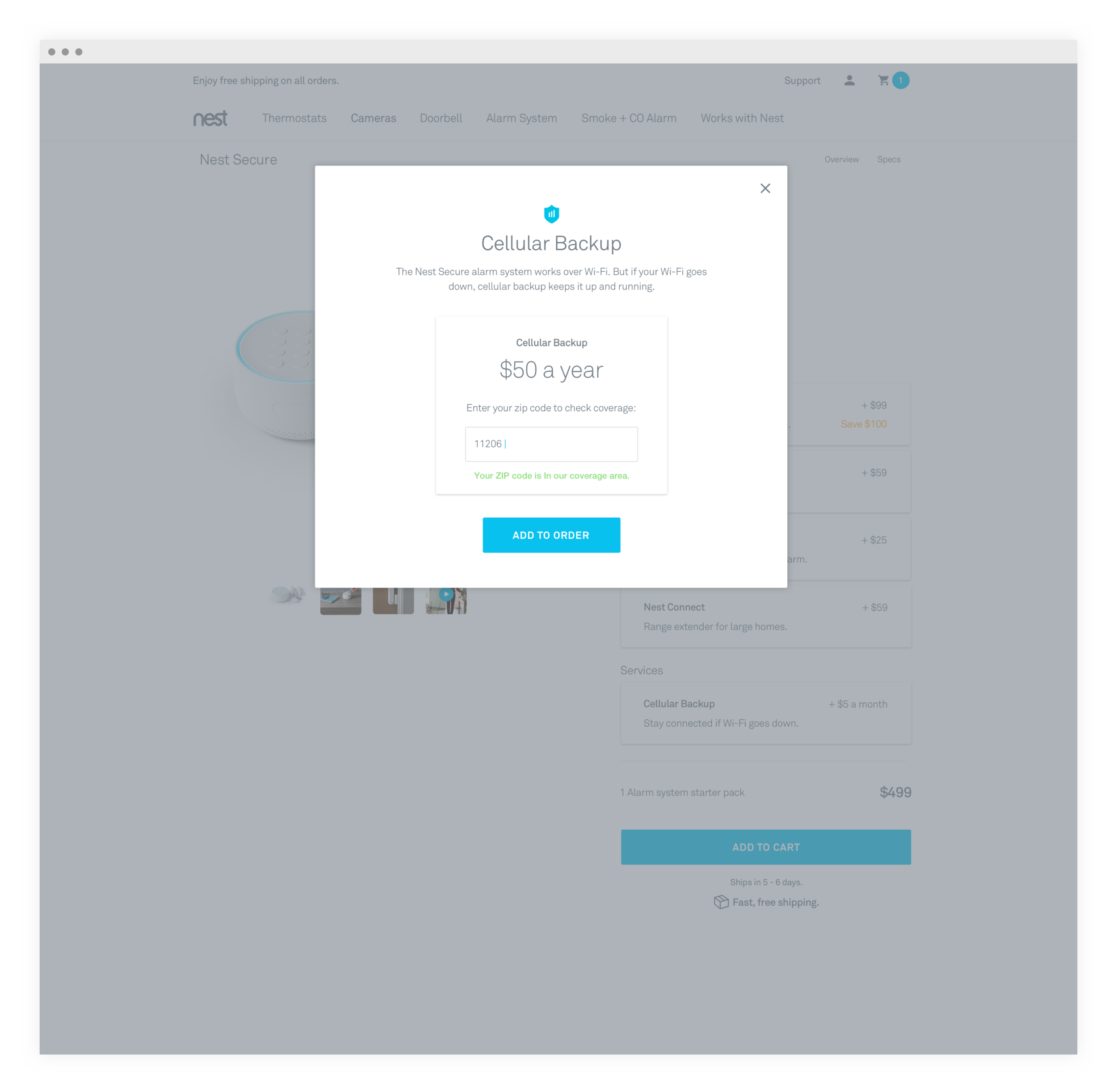
We then began to integrate our new design system and apply the logic to all product pages. By doing this, we increased the touch-targets for all selectors and made them more mobile friendly. We had to pressure-test our designs against Nest’s full lineup of products which introduced additional complexities such as optional add-ons and subscription services.


After integrating the new UI and reformatting the page content, we were able to improve the way users visualize their products and see edits in real-time.
1. Product name + Specs
We intentionally kept this anchored at the top of the page, giving the user a consistent sense of place and easy access to overview/specs.
2. Product Description
Folding this in was necessary for more complex products like Nest Secure, or bundle deals that sold groups of products on a single product page.
3. Dynamic Price Calculator
We moved this price to the bottom of the column to allow for the price to be dynamic as the user made changes above.
4. Product-add ons
We integrated product upsells into the main configurator, leveraging learnings we had with our initial round of changes.

Part 3: Cart and Checkout
As we moved onto the checkout process, a new set of UX challenges arose. Information was unclearly organized on the page and the existing page architecture wasn’t scalable for future Nest products. Items were not easily editable, rebates were not fully integrated, and subscriptions did not have a logical place on the page.
Our first objective was to parse out hardware totals separately from subscriptions. The old design didn’t properly communicate what totals were due and what they included. By having clearly defined subsections, we were able to parse out future recurring charges from the one-time hardware costs.

Problems with the Previous Design
1. Space Constraints
Displaying price in a separate column caused issues on smaller screen sizes. In order for this page to be mobile-optimized, we needed to remove this column.
2. Inability to Remove Items
Previously, decreasing the quantity to zero was the only way to remove items. The drop-down selector wasn’t intuitive and added an extra click in the process.
3. Disconnected Rebates
Energy provider rebates were previously isolated to the left of the cart totals and were not included in the cart totals.
4. Extraneous Information
Shipping and tax could only be calculated on the following page and shipping was always free. Displaying this information only when available would help simplify subtotals.

Updated Solution
1. New In-line Product Pricing
This allowed us to eliminate an extraneous column on the page and more clearly speak to item-level discounts.
2. Item Removal & Quantity Selector
We included UI updates that allowed for quick item removal, as well as updated quantity controls that required fewer clicks.
3. New Discounts and Rebates
Placement reserved for cart-level savings and energy provider rebates. Lining these up gives a clear path that adds up to the hardware subtotal.
4. Section-level subtotals
Intentionally placed messaging in lieu of a subscriptions subtotal since this was not due at point of sale. We also tidied up the overall subtotal to be clear about shipping and tax costs.
End Solution
The full flow here shows how a user customizes their order and proceeds to checkout.